Improving the User Experience of an Online Coffee Ordering App

In today’s fast-paced world, people want convenience and speed in everything, including their morning coffee. This is where an online coffee ordering app comes in, providing users with the ability to order their favourite cup of coffee from the comfort of their own homes. But how can we ensure that the app’s user interface and user experience are optimized to meet the needs of the users? In this case study, we explore the UI/UX research process for an online coffee-ordering app.
Must Read: 5 Reasons to Convert Your Website into Mobile Apps
Understanding the Problem
Before diving into the redesign process, we first conducted user research to understand the current pain points of the app. We interviewed coffee drinkers and observed their behaviour while using the app. We discovered that users had difficulty navigating the app and placing orders.
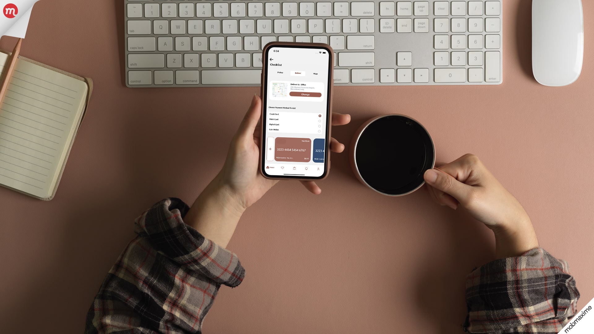
We also found that users needed clarification about the details of their coffee orders, such as the cup size, the amount of milk and sugar, and the type of roast. These uncertainties led to errors in order placement and frustrated users.

Designing Solutions
Based on our research, we identified several key areas that required improvement:
-
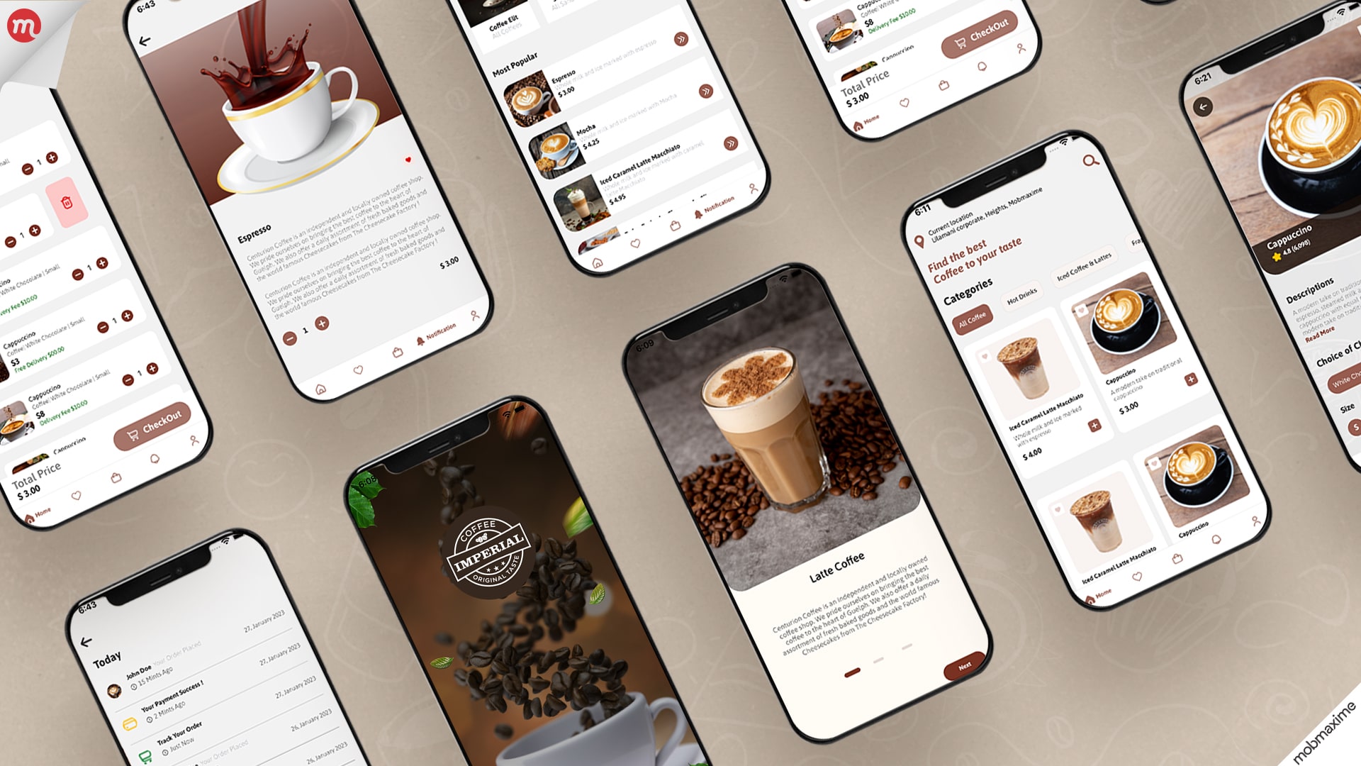
Streamlining the Ordering Process
We simplified the ordering process by reducing the steps required to place an order. In addition, users could now quickly select their preferred coffee options and customize them according to their preferences.
-
Improving Clarity of Information
We ensured all relevant information, such as the coffee type, size, and customization options, was display on the screen. This helped users understand what they were ordering and reduced the likelihood of mistakes.
-
Enhancing Navigation
We restructured the app’s layout to make it easier for users to find what they wanted. In addition, we added a search bar and improved the app’s menu design, making it easier to navigate.
Testing and Iteration
After implementing our design solutions, we conducted usability tests to ensure that our changes had improved the user experience. In addition, we observed users as they interacted with the app and gathered feedback.
We made several iterations based on the feedback we received, such as tweaking the order confirmation process and refining the wording on specific screens. By continuing to test and iterate, we created an app that was easy to use and met the needs of our users.
Results
The redesigned app received positive feedback from users, who appreciated the simplified ordering process and improved navigation. Our client also reported a significant increase in orders placed through the app, indicating that the redesign had successfully achieved its goals.
Conclusion
In conclusion, by conducting user research, identifying pain points, and iterating on design solutions, we significantly improved the user experience of an online coffee-ordering app. This case study highlights the importance of putting the user at the centre of the design process and continually testing and iterating to create a successful product.
Join 10,000 subscribers!
Join Our subscriber’s list and trends, especially on mobile apps development.I hereby agree to receive newsletters from Mobmaxime and acknowledge company's Privacy Policy.